
Resonix CreativeMy logo design for Resonix Creative, including logotype and cmyk inspired colour scheme, showing their skill for bringing stories to life using music, film and lots of creativity.
|
|
|
|
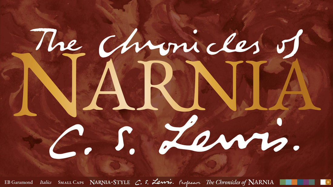
Return to NarniaA rebranding concept for The Chronicles of Narnia Series, including a new logotype, colour scheme, typography for book covers and animation. This is my creative idea as a response to a brief set by HarperCollins as part of the D&AD New Blood Shots Competition.
|
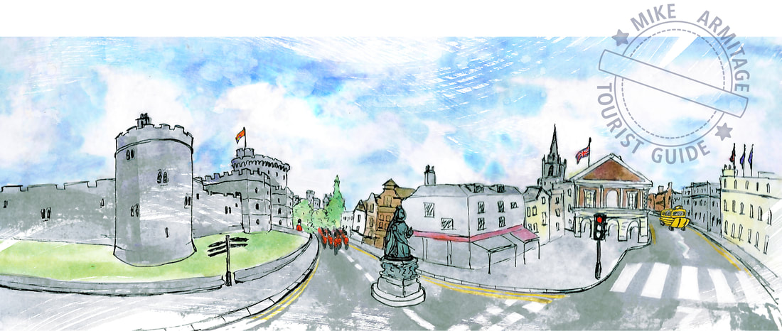
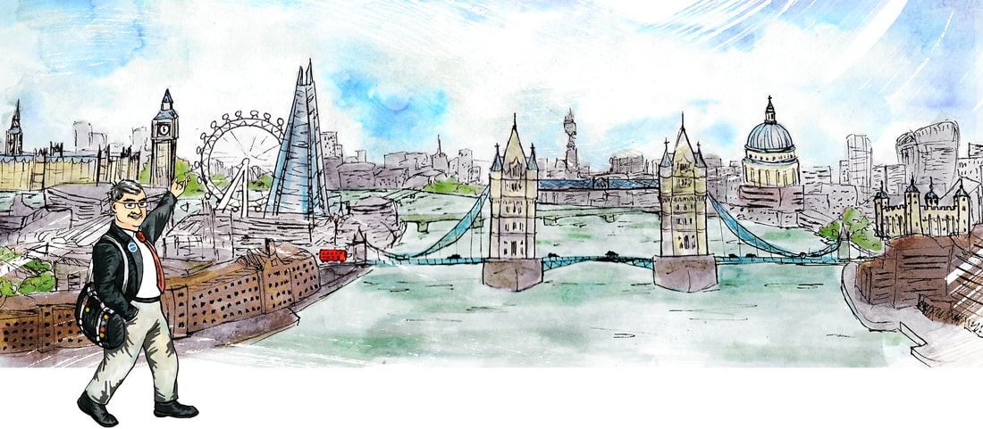
Mike Armitage Tourist GuideA logo and panoramas for a tourist guide, emphasising the blue badge guide qualification and a personalised, friendly experience. Elements of the logo are able to be used separately for greater flexibility.
|
|
|
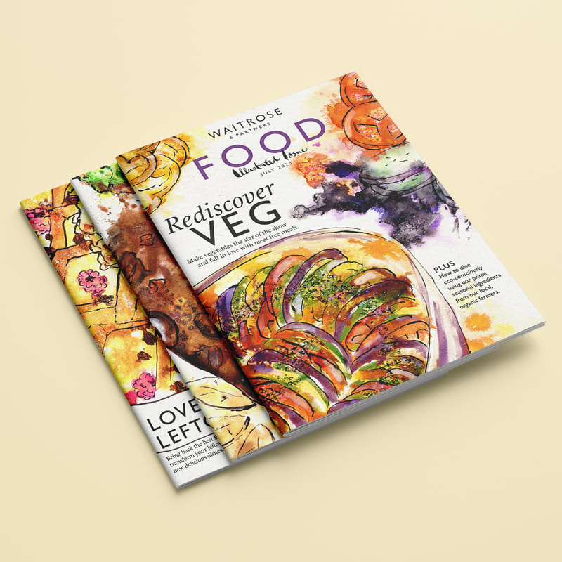
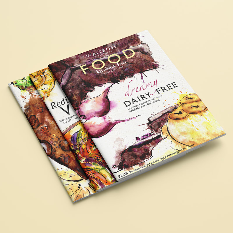
Waitrose Food MagazineA series of speculative Waitrose Food Magazine covers, inspired by their special illustrated edition. I used their existing magazine covers as a style guide for use of typography and carefully considered the layout.
|
|
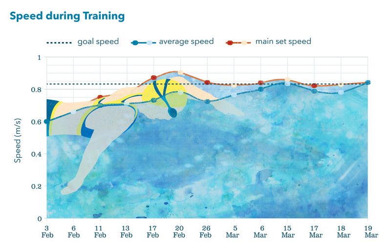
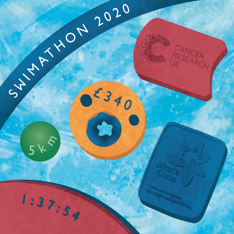
Swimathon 2020I used my Swimathon 2020 challenge as an opportunity to create some unique and exciting infographics to showcase my progress and thank my supporters.

|
|
|
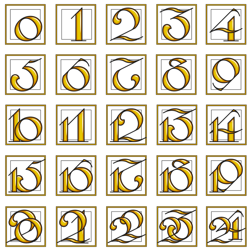
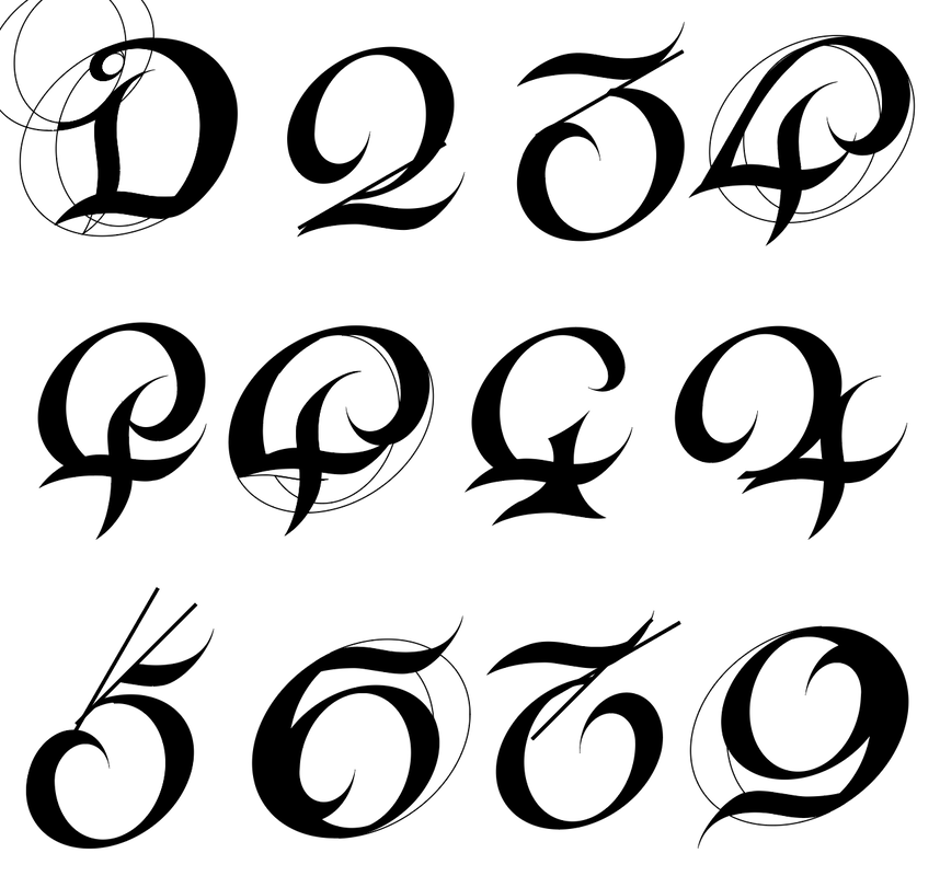
IlluminationA modular typeface inspired by historic illuminated letters and the origin of their name: to 'illuminate' is 'to shine' or 'to shed light on', originally referencing the gold ink commonly used to brighten manuscripts. This typeface was created for use in an illuminated advent calendar designed for social media.
|
|
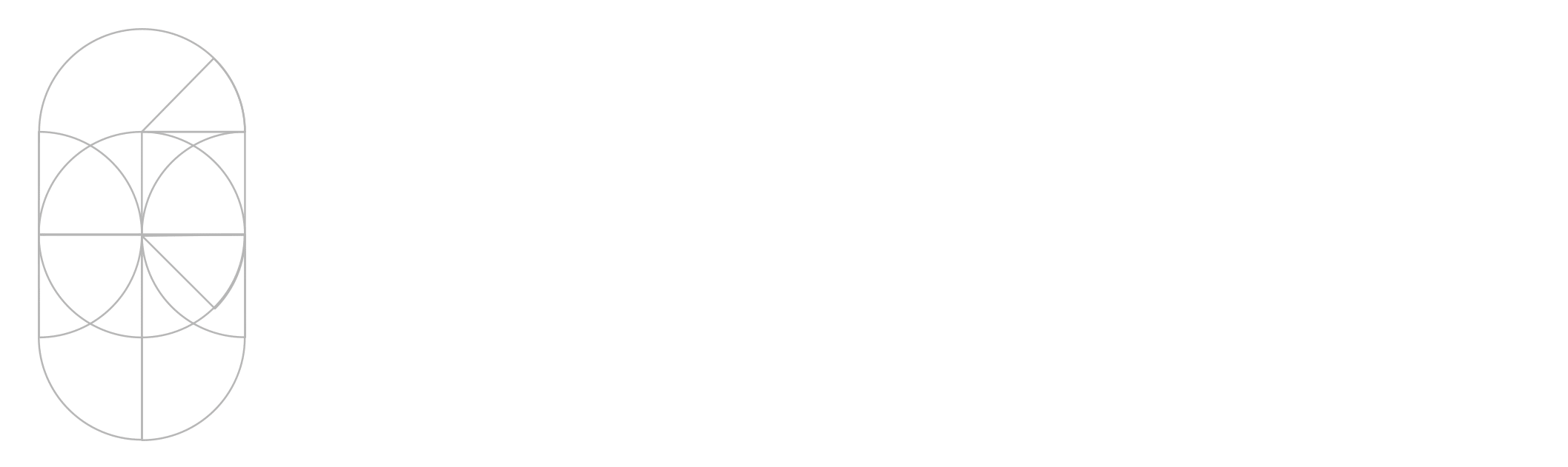
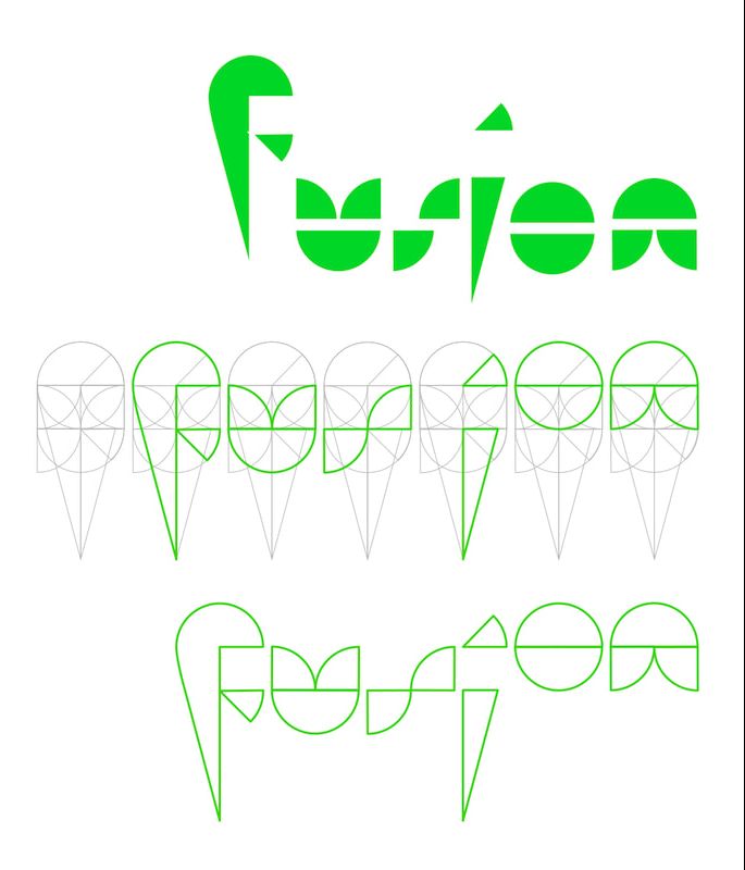
FusionA project on modular typefaces as part of a course in Digital Typographic Design, culminating in a logotype for an urban cultural events programme. I created an animation to show how each letter is cut from the same shape, creating a cohesion in the forms of the letters, and showing the adaptability of the logo.
|

|
The Importance of Illustration in Adult Fiction
Why settle for just one form of communication when adding another layer of storytelling can in fact enrich the experience? In a world that has become so overwhelmingly visual, with movies, TV shows, computer screens, video games, advertising, online articles, why is the adult novel one of the few products that doesn’t embrace the visual form of communication?
I felt that it was important that the presentation of this essay represented its contents, so typeset it fully using InDesign to create an engaging read.
I felt that it was important that the presentation of this essay represented its contents, so typeset it fully using InDesign to create an engaging read.
|
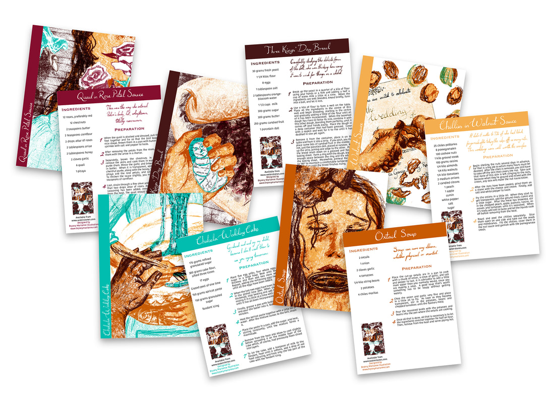
Like Water for ChocolatePart of creating illustrations for Like Water for Chocolate involved designing the typography for the titles, chapter headings and recipes throughout the book. When designing recipe cards I took careful consideration of the layout and typography that had to be clear and easy to read as well as reflecting the tone of the book. I combined the personal touch of the hand-lettering used throughout the book with a clear layout and modern, easy to read body of text.
|
Using Utopian and Dystopian Illustration in the Communication of Environmental Messages
An essay written and illustrated by myself, exploring the way illustration is used to promote environmental awareness, and using the same methods in my own illustrations. The layout and typesetting was as much a part of the project as everything else and was composed using Adobe InDesign.
SUBU Composers' Network |
Sadistitch
|
|
|
Scott Hazell Costume |